Introducing a structured approach to dashboard design
Dashboard design has two phases. Firstly, we must decide the information content. Secondly, we must decide how to present the information to the dashboard audience. Few, (Few, S. (2006) Information Dashboard Design: The Effective Visual Communication of Data; O’Reilly Media Inc) is the best starting point for looking at presentation and visualisation of dashboard data. The focus of this section is on the first step where we must decide which data, KPIs and summaries we want to include. Scorecard methodologies may help shape the information content in particular scenarios. However, my experience is that the myriad of possibilities can overwhelm users if we ask them to start with a blank sheet of paper.
To assist with the early stages of design I have developed a two stage structured approach to dashboard design. The technique provides good coverage of the data and a framework within which users can develop their requirements. The approach does not assume a particular BI product. Most reporting and dashboard tools that I have used have the requisite functionality.
In stage 1, I identify important business entities and create simple summaries of events and measures that describe the interaction between them. This provides high visibility of the data and supports reconciliation and quality checks in preparation for stage 2. Stage 2 assumes the users have validated the simple data summaries in stage 1. I can now present complex derived measures with the confidence of a solid foundation. A common mistake of the dashboard process is to move straight to stage 2, before users have validated the raw measures and had a chance to interact with the dashboard tool. The following sections provide a quick summary of my approach.
Stage 1 – Part 1 Identify master data entities
Let us assume a simple manufacturing company. It has a single factory where they build the company’s products. Wholesale customers order products through sales offices distributed throughout various regions. The customers are responsible for collecting the goods from the factory. From this description, we identify customer, product and office (which we report by region) as the master entities that drive the business.
Stage 1 – Part 2 Create simple dashboard and report
For each of the important master entities we design one dashboard and one list report. The list report has one row for each entity member. For example, the customer list would display one row for each customer. Each row in the list report is a link to the dashboard report for that member. Therefore, if you select Customer A on the list report you navigate to the dashboard report for Customer A. The table below provides the complete set of reports and dashboards we need to create for our example.
| Report name | Parameters | Links to |
|---|---|---|
Customer list |
Time period, |
Customer dashboard |
Customer dashboard |
Time period, customer |
Product dashboard/list, Region dashboard/list |
Product list |
Time period, set of products |
Product dashboard |
Product dashboard |
Time period, product |
Customer dashboard/list, Region dashboard/list |
Region list |
Time period, set of regions |
Region dashboard |
Region dashboard |
Time period, region |
Customer dashboard/list, Product dashboard/list |
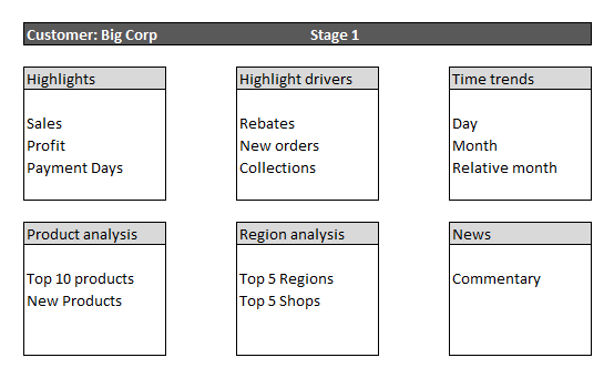
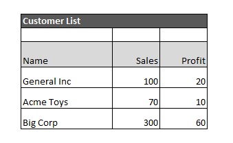
Figure 14 and Figure 15 show a possible layout for the stage 1 customer dashboard and list report.

Stage 1 entity dashboard

Stage 1 entity list
The list report can have any number of columns but we should select them on their ability to differentiate lines in the report. We use the list report to select an item to display in the dashboard. For example, a user analyses the list report, sees that Big Corp has the highest sales, and selects the Big Corp row to link to the customer dashboard for Big Corp.
The dashboard can have any number of sections and each section can contains graphs, individual figures, and tables. Each dashboard should have at least one section that shows the relationship between the entity in focus (customer in the example above) and the other master entities (product and region). For example, the Product analysis section of the dashboard shows the Top 10 products sold to Big Corp. The user can then navigate to the Product dashboard from the Customer dashboard by following the link in the Top 10 product list. The table below describes the sections I would normally include.
| Standard dashboard section | Description |
|---|---|
Highlights |
The key measures of interest to the business or relevant to the entity in focus |
Highlight drivers |
Secondary measures that influence the key measures in the Highlights section |
Time trends |
Normally line graphs or bar charts showing the trend of some Highlight measures over time for the selected period |
Product analysis |
Shows the important relationships between the customer and the products e.g. the Top 10 products the customer buys |
Region analysis |
Shows the important relationships between the customer and the region e.g. a list of regions the customer buys from |
News |
Commentary or news relevant to the customer |
In stage 1, we are not interested in sophisticated derived metrics. We just want to give users simple summaries so that they can browse and validate the data. Once the users can see the simple trends and summaries they are in a better position to define the more complex KPIs and derived measures that we introduce in stage 2.
Stage 2 – Part 1 Introducing more sophisticated metrics and KPIs
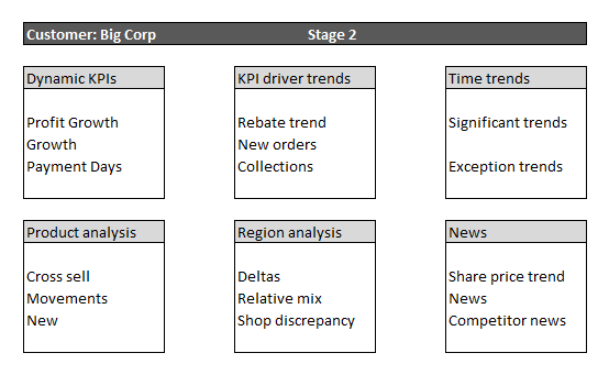
In stage 2 we can retain the same dashboard structure and mapping between entities and reports but rather than simple summaries we use more complex metrics and algorithms to move closer to the decision points that drive the business processes associated with the entity.

Stage 2 entity dashboard
| Dashboard section | Description | Example |
|---|---|---|
Dynamic KPIs |
Targets that are dynamically linked to the market or performance of a related group of entities |
Profit growth compared to average profit growth for all customers in the same region and industry type |
KPI driver trends |
Movements in the underlying measures that will have recently influenced the KPIs |
Rebates as a percentage of revenue up 5% on parallel period in previous year |
Time trends |
Trends that are significantly different to expected trends |
Orders up 20% above average order growth for similar customers in same period |
Product analysis |
Complex relationships between customer and product |
Customers with similar attributes to this customer bought more of these products (as a % of total spend) than the current customer |
Region analysis |
Complex relationships between customer and regions |
Regions whose growth is lower than other regions and lower than average growth for similar customers in that region |
News |
Market data relevant to the customer or industry sector |
Customer announces merger with another company. Possible opportunity for new sales due to growth through acquisition |
We can also amend the list report to allow selection of entities based on metrics and KPIs. Ideally, the user should be able to sort the list report by each of the columns so they can quickly identify interesting rows in the list. We should also provide the choice of more focused list reports. An example might be a list of all customers who are significantly under their sales target.
Stage 2 – Part 2 customising for user requirements and business processes
The previous steps in the process should provide users with a good grounding in the possibilities inherent in dashboard design. They should now have enough familiarity with the tool and method to start creating their own dashboard designs.
We have aligned the dashboards to business entities, but we may create specialisations of these dashboards for each business process. For instance, we might create a customer dashboard for sales, and then another dashboard design for working capital. We could do the same for region. Marketing managers will be interested in the customer centric view. Office managers will want to know how their region is tracking.
Strengths of a dashboard approach
Having considered a structured method for dashboard design, we look now at some of the non-functional advantages of this approach. Dashboards are often a more focused alternative to ad hoc query tools so we make comparisons between the two styles where appropriate.
Data validation
Data preparation for DW and BI normally involves some degree of data transformation and the application of business rules. Domain experts will need to validate the data before it can reliably support decision making and more complex applications like data mining. Dashboards provide a user-friendly interface to the data. Reviewing aggregate values and graphs makes it easier to spot issues and outliers than generating random ad hoc queries. The structured approach used to create the dashboards also lends structure to the validation process, providing consistent views of the data and good coverage. We can design a validation plan using the dashboard reports with various parameters.
Usability
Ad hoc tools are powerful in the right hands but require the users to have a good knowledge of both the tool and the semantics of the data model. For example, multidimensional databases are particular vulnerable to misinterpretation. There are often large empty spaces in the cube and certain selections (slices) of dimensions can present unintuitive results. Good dashboard design allows us to assimilate the information quickly. We expose several perspectives that would be time consuming to construct manually.
Performance
Dashboard queries have a fixed structure with a number of parameters. This results in a predictable workload for the database. A predictable query workload is essential for database optimisation.
Ad hoc analysis may also follow standard paths of exploration but there is no constraint to say they must. Users generate a large number of intermediate queries getting to the view they are interested in. Inexperienced users may unintentionally launch complex queries that drain server resources and deny quick service to other users. Slow response time in the initial releases may turn your sponsors off the solution. In contrast, consistently good query response time in the early releases will give users confidence in the solution; this is far easier to achieve through structured dashboards than managing ad hoc access.
Security
Ad hoc query tools often rely on the security model of the underlying database. Analytical databases can support a number of complex security scenarios but there are limitations. Complex scenarios may affect query performance and it may be difficult to validate that the security model behaves as required.
It is easier to align security in the reporting layer with business processes. BI solutions often utilise data from multiple business units and functions unrelated to the user. It is difficult to define this type of security at the data layer.
